03.9.22 ‘Tune in Tomorrow’: Book cover evolution — and reveal!
Writing a book is hard.
Getting a book published is harder.
But every step along the way – which seem to come after long-anticipated silences, punctuated by lurching bursts of activities – is pretty exciting, because each step allows you to remember all over again: I have a book being published. By people who don’t have a reason to be nice to me. By people who were willing to make a business decision based on words I put on paper.
And the latest step in this process is … THE COVER.
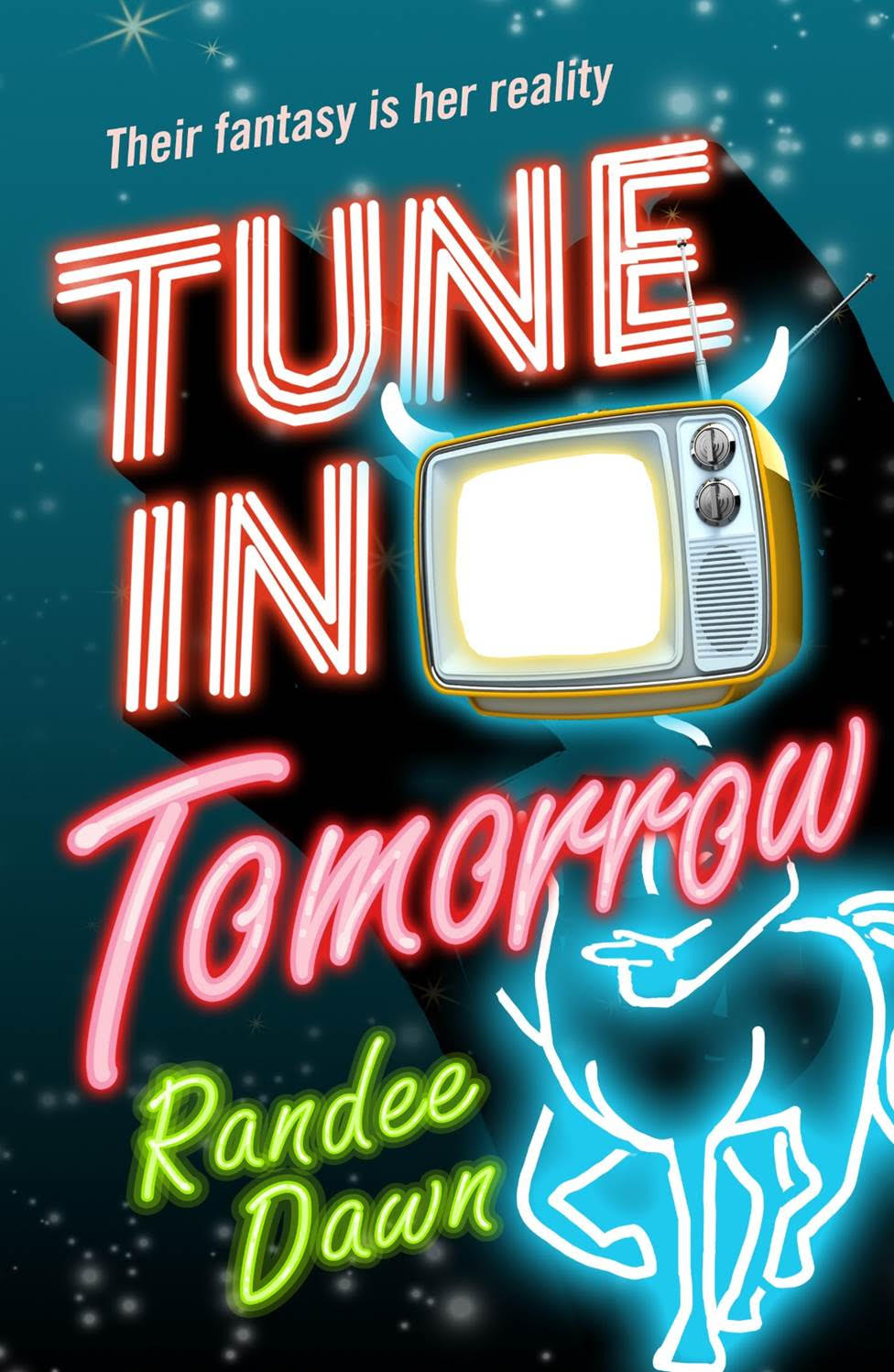
Yes, my book: she has a cover. Tune in Tomorrow, due out on August 16, finally has a COVER. And as The Mary Sue revealed on Wednesday, here is that cover in all her glory:

Truly, this is a bit of magical alchemy – because from the first iteration of this cover, which I saw all the way back in October of 2021 – whoever read the book and decided to put these elements together did the unimaginable: Made something I wouldn’t have thought of, but which utterly reflects the book in about 100 different, amazing ways. (Credit where due: HeadDesign is responsible for this one.)
It is loud. It is garish. It has a TV on it (an old-fashioned one, but let’s face it, the black mirrors we watch today just scream “screen,” not “entertainment device”). It has neon. There are stars and a centaur.
*Chef kiss!*
Years ago, I started reading a ‘zine called Beer Frame by Paul Lukas, who introduced me to the fantastic world of applying criticism to mundane objects and foods (sometimes stranger foods). The journey was hilarious, and he often topped everything off by reviewing not albums, but covers of albums. Of course all of us examine the covers of albums and books to get a feel for what’s to be presented inside — something we can’t enjoy fully unless we have the object in our possession for an extended period — which makes the cover of such a thing the equivalent of greeting you at the front door of your home: You may have interior decorated the hell out of the place, but if someone throws a mud pie in your face when you ring the doorbell, you’re probably never going to see what it looks like inside.
(Quick note: Here’s a bit of those food/object reviews, which were compiled in a book called Inconspicuous Consumption; for years, Lukas has now applied his skills to reviewing athletic uniforms.)
In any case, once I started getting into the publishing side of writing, I grew interested in how to create the cover that would really wow potential readers. I joined a group on Facebook called “Does My Book Cover Suck?” and picked up a few tips — some books have too many fonts, there’s no focus on what it’s about, the stock art is too generalized or unrealistic, and so forth. I felt geared up to tackle a potential book cover that I was not 100 percent happy with — but also knew I’d have a limited number of revision options once a draft landed on my desk. Suffice it to say, the cover that is the finished beast is not the final one.
And so, I thought I’d take you on a little journey of what some of those previous drafts did look like. Here are a couple of the iterations the cover has gone through in its journey from Version 1 in October – to this shining beauty. Let’s begin with the October 2021 cover, the first one I got to see:
As you can see, most of the elements are in place: TV, centaur, neon, sky. But that sky looked rather sickly teal to me, and the TV seemed empty. The title letters are rough and wobbly. I also worried it was a bit busy – so many fonts, so much going on. So I asked about a few tweaks and in November we ended up with …
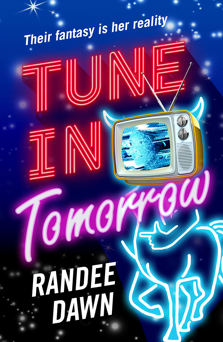
Aha! The TV has a face! Starr? Not Starr? Well, that’s for you to decide. I think this one more clearly shows the horns growing out of the TV set, which in theory is set on a centaur’s body, even though centaurs don’t have horns. But fauns do. All will make sense to readers — I love getting into a book and occasionally darting back to the cover as things reveal themselves in the text — so I definitely liked it. The colors were far better — I wanted a deep blue/dark night sky with galaxies of stars, and they delivered. What stuck with me, though, was the name change: It had a pasted-on, flat quality to my eyes; the other letters were so vivid and three dimensional. Plus, as my agent noted, the black night sky didn’t quite flow right around the centaur. So we weren’t done yet.
A long break ensued … and in February, this arrived in my box:
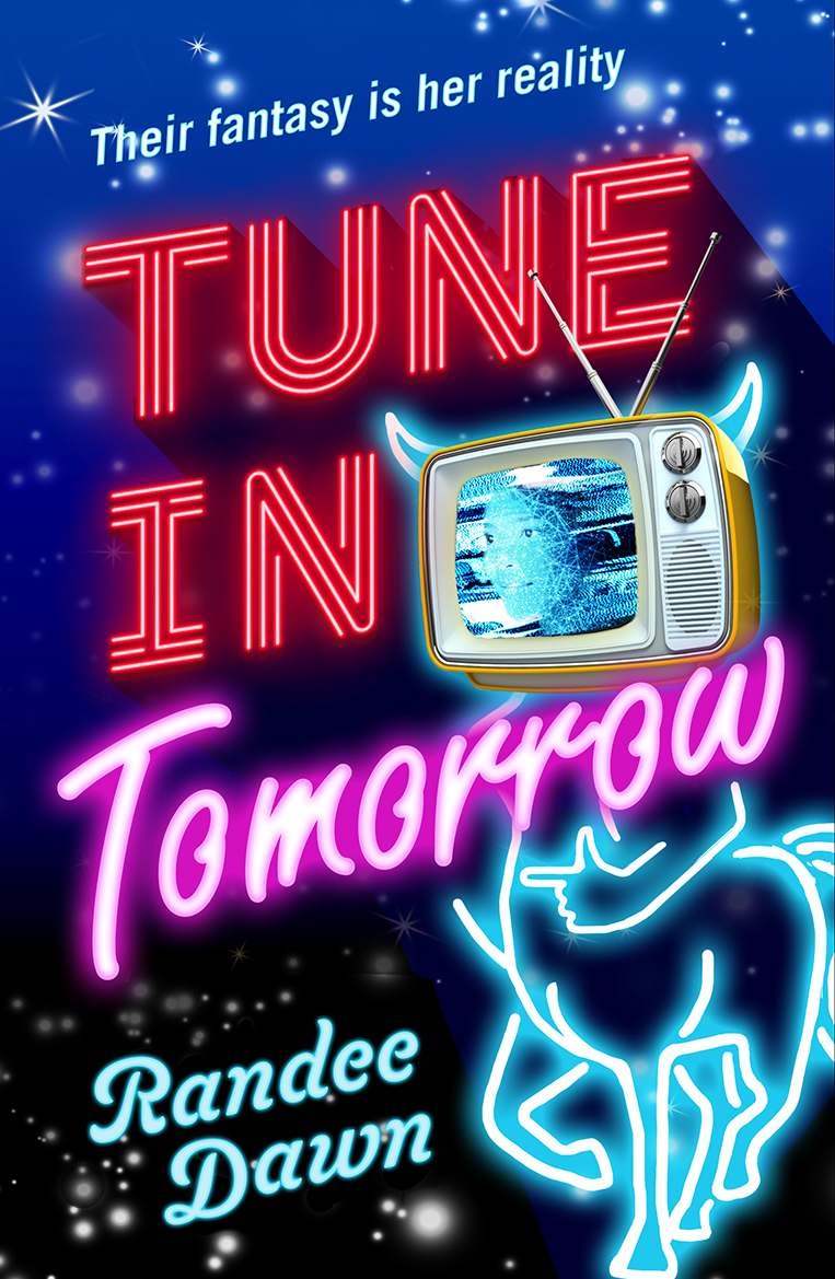
The only real change: My author name. And I just wasn’t loving it … it felt a bit too adolescent. I wanted it to go back to being the neon of the first cover, but was told that sharing the font would make the name seem like part of the title. And the deep black night sky still needed to be pushed closer to the centaur body. So I pushed once more, hoping I wasn’t irritating anyone overly and …
We landed on the final cover! The name: scripted, but not overly fussy. The blues, the blacks, the images – I’m on board and proud to wave this bad gal around. Shamelessly.
Covers are such funny things. You can spend years assembling the words inside, but this “greeting” is what has to jump out at most people first. What’s going to make it stand out from all the other serious, fussy, abstract, photo-realistic covers on the shelves? How do you get a version that explains your book without giving it away? That’s what I’m hoping this cover does: Makes a loud noise, signals to just the right readers as it sits on the shelf … and finds its way into many, many hands.
What works for you in a book cover? What turns you off? Speak up in the comments!
Pre-order Tune in Tomorrow on Amazon.
Pre-order Tune in Tomorrow on B&N.
Like what you’re reading? Donate here!
Want to get your book featured on my blog? Contact me here!
Want to get my newsletter (and a free book)? Sign up here!
It’s a fabulous book cover. The evolution covers were good, too, but the final product is the best!
That’s the best kind of feedback I could expect! So glad you like it … and here’s hoping you like the inside of the book, too!
I like its boldness except that the word “Tomorrow” jumps out at me, but not in a good way. It may be that I don’t care for that particular script.
Jumping out, I think, is good! If it jumps out to people on the shelf they might pick it up. But everyone’s tastes are different. 🙂